
Description
Description of the " Master-data (MDM) " table
Viewing data in tables is possible through the built-in query editor for "SQLite" databases
Work in the mode with the central database is supported.
To configure the program in this mode, use the following instructions.
The master data is a structured catalog of data stored in randomly constructed cards created in the page master.
MDM - allows you to store arbitrary information in a structured way, a description of systems, networks, servers, databases, contacts, products, etc.
MDM supports both local application storage and single storage mode.
Starting the Master Data Manager
In the main window of the program, click the " Master Data Management " button


Control buttons

Page creation wizard
Creating root entries for the object tree
Adding a node to a tree
Refresh object tree
Card creation
Refresh the structure of the current card and display the data
Card search
Moving a card to another node
Remove card / empty node
Create a page to store data
Launch the page creation wizard

Control buttons

Create a new page
Create a directory
Add item to page
Move element to another node
Export / import page
Refresh the page list
Remove item from page
Click the " Create new page " button
In the " Value " field, enter the name of the page
Close the catalog editor window

Adding an element to the generated page
Select a page (an element on a page) in the " Page structure " list
Open the " Add new element " menu and select the required element from the list

Element parameters
To set element parameters:
Select an element in the tree
Press the button " Show and edit parameter "
Save the entered parameters by pressing the " Save " button
SPLITTER

It is an element consisting of 2 connected panels.
Align - the position of the element on the form.
-
Top - press the element to the top of the form
-
Left - push the element to the left edge of the form
-
Right - press the element to the right edge of the form
-
Botton - press the element to the bottom edge of the form
-
Client - the element takes up the entire space of the form
AlignWithMargin - padding along the edges of the element
RealTimeDrag - False, a mask is displayed showing the new position of the strip. True, the bar moves as you move the mouse.
HotSpotVisible - show button to resize panels
Percent - the percentage occupied by the first panel of the total width
Height - the height of the element
Width - the width of the element
LockBar - prohibit changing panels with the mouse using the resize button
Orientation - the orientation of the panels relative to each other.
GROUPBOX
Panel with additional decoration in the form of a frame around and a title
Align - the position of the element on the form.
-
Top - press the element to the top of the form
-
Left - push the element to the left edge of the form
-
Right - press the element to the right edge of the form
-
Botton - press the element to the bottom edge of the form
-
Client - the element takes up the entire space of the form
AlignWithMargin - padding along the edges of the element
Height - the height of the element
Width - the width of the element
Style name - element style name
Caption - title
Font size - font size
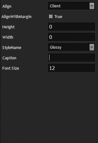
LABEL

Text label
Align - the position of the element on the form.
-
Top - press the element to the top of the form
-
Left - push the element to the left edge of the form
-
Right - press the element to the right edge of the form
-
Botton - press the element to the bottom edge of the form
-
Client - the element takes up the entire space of the form
AlignWithMargin - padding along the edges of the element
Font size - font size
Layout - vertical arrangement of text on an element
-
Center - in the center
-
Top - press the text to the top
-
Bottom - press the text to the bottom
Caption - text
Style name - element style name
Height - the height of the element
Width - the width of the element
Aligenment - horizontal position of text on an element
-
Left - press the text to the left corner
-
Center - text in the center of the field
-
Right - press the text to the right corner
EDIT

Text input field
Align - the position of the element on the form.
-
Top - press the element to the top of the form
-
Left - push the element to the left edge of the form
-
Right - press the element to the right edge of the form
-
Botton - press the element to the bottom edge of the form
-
Client - the element takes up the entire space of the form
AlignWithMargin - padding along the edges of the element
Height - the height of the element
Width - the width of the element
Font size - font size
CharCase - text case
-
normal - text in any case
-
upper - uppercase text
-
lower - lowercase text
TextHint - hint for entering text. The tooltip is displayed in an empty field
NumberOnly - the field contains only numbers
Style name - element style name
PAGE CONTROL

Pages panel - initially empty, pages are created separately
Align - the position of the element on the form.
-
Top - press the element to the top of the form
-
Left - push the element to the left edge of the form
-
Right - press the element to the right edge of the form
-
Botton - press the element to the bottom edge of the form
-
Client - the element takes up the entire space of the form
AlignWithMargin - padding along the edges of the element
TabHeight - page header height
Font size - font size
Width - the width of the element
Height - the height of the element
Style name - element style name
PAGE

Page for the " Page control "
Caption - page title
RADIOGROUP
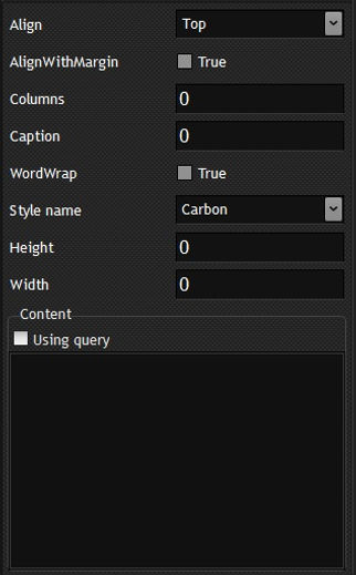
An element that allows you to select one of the values
Align - the position of the element on the form.
-
Top - press the element to the top of the form
-
Left - push the element to the left edge of the form
-
Right - press the element to the right edge of the form
-
Botton - press the element to the bottom edge of the form
-
Client - the element takes up the entire space of the form
AlignWithMargin - padding along the edges of the element
Columns - the number of columns
Caption - title
WordWrap - output text to multiple lines
Style name - element style name
Font size - font size
Height - the height of the element
Width - the width of the element
" Content " block - values for the element
Using query - values for the element are generated by a SQL query
If Using query is not set, a list of values must be specified in the field. One value per line
PANEL

Item for storing other items
Align - the position of the element on the form.
-
Top - press the element to the top of the form
-
Left - push the element to the left edge of the form
-
Right - press the element to the right edge of the form
-
Botton - press the element to the bottom edge of the form
-
Client - the element takes up the entire space of the form
AlignWithMargin - padding along the edges of the element
Height - the height of the element
Width - the width of the element
Style name - element style name
COMBOBOX

Drop-down list
Align - the position of the element on the form.
-
Top - press the element to the top of the form
-
Left - push the element to the left edge of the form
-
Right - press the element to the right edge of the form
-
Botton - press the element to the bottom edge of the form
-
Client - the element takes up the entire space of the form
AlignWithMargin - padding along the edges of the element
DropDownCount - the number of lines in the visible part of the drop-down list
Height - the height of the element
Width - the width of the element
Style name - element style name
Style - the style of the element
-
DropDown - allow value input
-
DropDownList - no values entered
Block " Default data "
List - a list of values. One value per line
SQL - query to get a list of values
Previously introduced - the values previously entered into this field. Works with Style = DropDown
RICHEDIT

Multiline text box
Align - the position of the element on the form.
-
Top - press the element to the top of the form
-
Left - push the element to the left edge of the form
-
Right - press the element to the right edge of the form
-
Botton - press the element to the bottom edge of the form
-
Client - the element takes up the entire space of the form
AlignWithMargin - padding along the edges of the element
ScrollBar - scroll bars
-
None - do not show the scrollbar
-
Both - horizontal and vertical scroll bar
-
Horizontal - only horizontal scrollbar
-
Vertical - only vertical scrollbar
PlainText - which format RichEdit works with. False - RTF format, True - plain text
Style name - element style name
WantTabs - can I enter a tab character
WordWrap - wrap text for long lines
Font size - font size
Width - the width of the element
Height - the height of the element
Location of elements
A number of elements (panel, groupbox, splitter, page) can serve as parent elements for other elements.
The number of nested elements is not limited.
Moving elements
Created elements can be moved both within the current parent object and to another level.
Moving elements on the current level
Select an element in the tree
Press " Element up " to move up or " Element down " to move down
The location of the element on the level determines its position when creating the page.
Moving an element to another level
Select an element in the tree
Press " Move element " button
In the window that opens, in the tree, select a new location for the element
Press the " Move " button

Deleting an element
To remove an element:
Select an element in the tree
Press the " Delete element " button
Important: the deletion of elements is performed cascaded, i.e. both the selected element and all its child objects are deleted.
Creating lookup tables
A number of page elements support retrieving data using SQL queries.
The data for these queries can be formatted in the form of reference tables.
To create a dictionary table, start the dictionary creation wizard by clicking the "Create or edit the library tables" button
Directory Creation Wizard

Create a table
Press the " Create new reference book " button
In the " Tablename " field, enter a new name for the directory
Enter a comment in the " Comment " field (optional)
Add columns
In the field " Column name " enter the name of the column
From the drop-down list " Column data type " select the data type
Click the " Add column " button
Save the table by pressing the " Save " button
Important : The table will not be created until the " Save " button is pressed.
The program does not support deleting columns in the created table.
Adding columns is possible after creating a table
Select table in " List table "
Press the " Edit " button
Add columns
Save by pressing the " Save "
Adding an Entry
Select table in List table
Press the " New " button
Fill in the fields in the " Edit data " block
Two fields ( id and create_dttm ) are not allowed to be edited, they are displayed informationally
Save the entry by pressing the " Save " button
Important: in the " Edit data " block, the columns are displayed in reverse order with respect to the table structure
Changing an entry
Select table in List table
Select a table entry in the " Table data " list
Change field value in " Edit data " block
Two fields ( id and create_dttm ) are not allowed to be edited, they are displayed informationally
Save the entry by pressing the " Save " button
Deleting an entry
Select table in List table
Select a table entry in the " Table data " list
Press the " Del " button

Deleting a lookup table
Select a lookup table in the " List table " list
Press the " Delete reference book " button
Export/import page

Page export
In the window " Page configurator " in the tree " Page structure " select a page
Expand menu " Export/import page "
Select " Export page "
If it is necessary to unload reference tables as well, select them in the " Library " list by setting the checkboxes
Press the " Export " button
The operation execution log will be displayed in the " Log " field
The export file will be created in the .\config\export\<Card name>.crd directory
The export file is a SQLite database with a password of 221122 and aes-256 encryption algorithm

Page import
Expand menu " Export/import page "
Select " Import page "
In the " Container " field, specify the full path to the export file
If you need to import a card with a new name, then specify it in the " New card name " field
If you are importing a card previously created in the same database, then set the radio button " Generate new ID element "
Select the data loading mode in the " Type load card " block
Create new - create a new card
Replace exists - recreate an existing card. The data saved in the card is not deleted earlier, only the metadata of the card is replaced
Add new element - add new elements to an existing card
Select the method of loading lookup tables in the " Type load library " block
Load new - load only new directories
Drop and create - preliminarily execute the command to delete imported directories in the repository
Press the " Import " button
The data loading log will be displayed in the " Log " field

master data

Creating Tree Nodes
Press " Create node " button
In the field " Value " enter the name of the node
Save the value in the catalog by pressing the " Save " button
Tree formation
Select the node in the tree for which you want to add a child object
" Add node " button pressed
Select an entry from the " Parent list "
Press the " Insert children " button

Create a card
Fill in the fields of the card. Required field " Page name (tree view) "
In the " Tree the object " tree, select the node in which you want to create an entry
Expand " Add new page " menu
Select the card to fill out


Editing a saved card
Open the card for viewing (by selecting it in the tree or finding it through the search)
Press " Edit page " button
Make changes to the page
Save Changes